Published inTDS ArchiveAnalyze Data quickly with EsquisseA Review of Esquisse — a free Tool to Perform Data Analysis and VisualizationsApr 15, 2022Apr 15, 2022
Published inTDS ArchiveHow to create Web-friendly Charts with Apache ECharts and Python?A Step-by-Step Tutorial on how to use PYECHARTS to create Apache ECharts with Python and JavaScriptApr 13, 2022Apr 13, 2022
Published inCodeXHow to Use Trading APIs to Visualize Crypto Price InformationA Step-by-Step Tutorial on how to use the Binance Python APIMar 31, 20221Mar 31, 20221
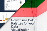
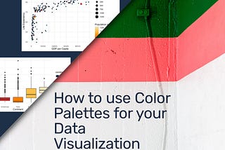
Published inTDS ArchiveHow to use Color Palettes for your Data VisualizationA Step-by-Step Color Palette Tutorial for Seaborn, Altair, and ggplot2 (R)Mar 19, 20224Mar 19, 20224
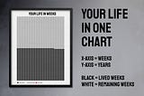
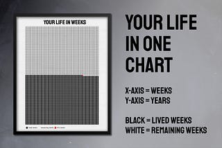
Published inTDS ArchiveHow to Visualize the Rest of Your LifeA Step-By-Step Tutorial to create a Data Viz Chart with your Life in Weeks using Python and AltairJul 19, 20213Jul 19, 20213
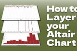
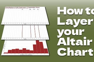
Published inTDS Archive3 Visualization Layers for Information-Rich Charts with Altair and PythonHow to Improve your Storytelling by Adding Useful Information on Your ChartJul 7, 20211Jul 7, 20211
Published inTDS Archive7 Data Wrangling Python Functions in under 5 MinutesA Step-by-Step Walkthrough of the most basic but yet most-used Data Manipulation FunctionsJun 19, 20211Jun 19, 20211
Published inTDS Archive7 Data Wrangling R Functions for your next Data Science Project in under 5 MinutesA Step-by-Step Walkthrough of the most basic but yet most-used Data Manipulation FunctionsJun 11, 2021Jun 11, 2021
Published inTDS ArchiveCreate Flawless Tables from your Dataframe ready for PublicationA Step-by-Step Tutorial How to Create Publication-Ready TablesJun 6, 20211Jun 6, 20211
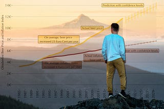
Published inTDS ArchiveHow to Predict and Visualize Data in one ChartA Step-by-Step Tutorial How to Use R and ggplot2 along with Linear RegressionMay 8, 2021May 8, 2021